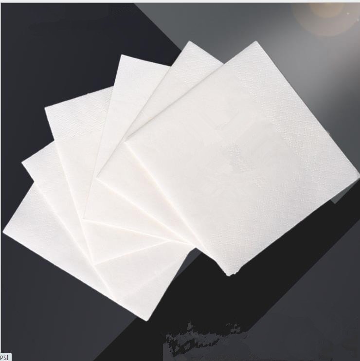
A live custom-napkin listing offers 33 by 33 centimetres, quarter-folded, three-ply at 18 gsm, packed twenty per bag and one hundred bags to a carton. The whole sheet is the printable area. Here is the part the listing does not say: by the time that napkin reaches a guest, it has been folded into quarters, and the guest sees one face – a quarter of the sheet if it is quarter-folded, an eighth if it is folded for a dispenser. Most of the artwork you paid to print is hidden inside the folds, and nothing on the listing tells you where it sits once folded.
That is the difference between buying printed napkins and buying branded napkins. Branded ones are designed backwards from the folded face. This page is about where the logo actually sits when the napkin is in service, how much of your artwork survives the fold, and what a multi-site operator does to hold colour and placement stable across reorders.
Key Takeaways
- Fold geometry decides visibility: a quarter-fold presents one quarter of the sheet as its top face, and an eighth-fold presents one eighth, so placement, not print coverage, determines what a guest sees.
- Border embossing and print occupy the same two dimensions; specifying a decorated border without looking at your logo position is how a brand mark ends up competing with a pattern it cannot beat.
- Observed catalogue formats (33×33 cm, quarter-fold, 18 gsm, 20 per bag) are market data to compare against, and a live listing review on one custom-print offer reads: “size of napkins was too small. will reorder larger size” – the spec-to-usage gap is real and common.
- Colour across reorders is a file-and-sample discipline, not a promise: archived artwork with a version number, an approved first-article sample, and a retained reference sheet per run.
- Water-based ink and the food-contact question, plus the full ordering workflow, are owned by the printed-napkin guides; this page only sets the placement and consistency node.
- What the Fold Hides
- The Visible Face Is a Placement Problem
- Border Embossing Against Logo Space
- Holding Colour Across a Chain
- What the Listings Actually Promise
- The Multi-Site Rollout Spec
- Frequently Asked Questions
What the Fold Hides
A quarter-fold napkin presents one of four equal areas of the unfolded sheet as its top face, and an eighth-fold presents one of eight. The arithmetic is blunt: the quarter-fold top face is twice the area of the eighth-fold top face, 0.25 against 0.125 of the sheet, and both are far smaller than the full sheet your artwork department laid out. Nothing about this is a defect. It is geometry, it is predictable, and it decides the job of the design.
What the folds physically are, and how a 1/4-fold behaves against a 1/8-fold in a pre-set line, is covered properly in the dinner napkin fold guide. The placement consequence is this page’s business: full-bleed artwork is the default because it is how design software saves files, not because it is how guests see napkins.
The Visible Face Is a Placement Problem
Design the napkin from the folded face outward. Choose which quadrant of the 1/4-fold becomes the guest-facing face, place the logo there, and treat the other three quarters as continuity – pattern, tone, or a repeating mark that is allowed to rotate and disappear into the fold. A logo printed so that part of it disappears into a fold line is the single most common branded-napkin failure, and it is invisible in every proof until the napkin is folded.
The Dispenser Stack Changes the Presentation Again
A stacked dinner napkin presents its top face. A napkin staged in a dispenser presents its folded opening, which shows one face and the start of another – a half-open composition that shares a logo awkwardly if the artwork was designed for a flat sheet. Specify which presentation the napkin gets: table pre-set, tray, dispenser, or a mix, because placement can only be optimised for one at a time. The dispensers that accept these formats, and which napkin goes with which fixture, are mapped in the food-service size and fold guide.
Border Embossing Against Logo Space
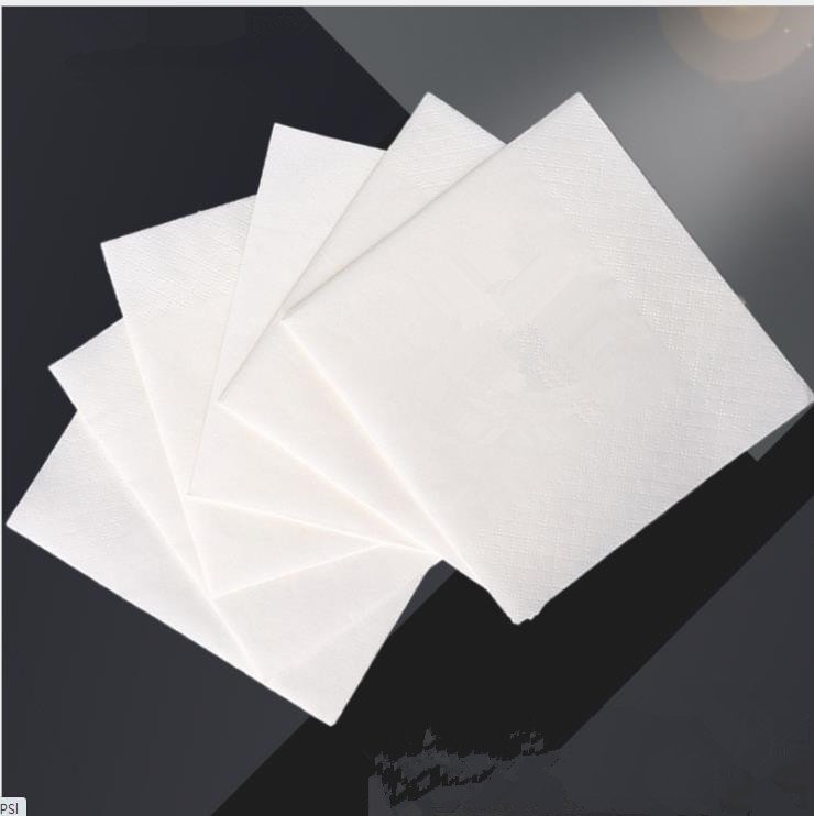
Border embossing is one of the finishes buyers ask for immediately – it frames the napkin and photographs well – and it is a quiet enemy of legible logos. Both the print and the debossed border occupy the same two dimensions of the sheet, and on a quarter-folded napkin the logo lives near the fold lines, exactly where the border runs on many designs. The result is a mark fighting a pattern for the same edge of the sheet, and the pattern usually wins because it is continuous.
Three rules keep the two out of each other’s way. Emboss first, print after, so registration is set by the pattern you will actually see. Keep the logo out of the border band by at least one fold unit of the sheet, measured on the folded face, not on the flat artwork. And request a folded proof – a physical napkin folded the way it will be served – before plates are made, so the conflict shows up while it costs a plate fee rather than a container. That folded-proof step is part of the wider artwork-to-sample workflow that the logo napkin buying guide runs end to end, and the two pages split cleanly: that guide owns the workflow, this page owns the placement.
Holding Colour Across a Chain
The second most common complaint about branded napkins is not design; it is drift. The napkin ordered for a restaurant opening in March is a different blue by the September reorder, and neither version matches the menu cover. Colour difference across runs is normal in every print process; what separates a professional programme from a surprise is whether the drift has a document to be measured against.
The File-and-Sample Discipline
Three documents, all of them cheap. The archived artwork with a version number – this mill archives client-specific private-label design files permanently, and a reorder does not attract a repeat plate charge, so the file you approved is the file that exists. The approved first-article sample, signed and dated, against which every reorder is compared. And the retained reference sheet from the production run, because the approved sample and the production run are two different realities and a claim needs the one that was actually shipped. A multi-site operator prints that discipline once and then simply repeats the version number on every purchase order.
What Colour-Matching Language Is Safe to Rely On
Put the reference in the order: Pantone references if the printer works with a Pantone system, or a physical swatch if not, and state that production goods must match the approved first-article sample within the tolerance both sides can see on a folded proof under the venue’s light. What no party should do is agree to an absolute colour guarantee with no sample and no archive to judge against. Under the light of a dining room at seven in the evening, the first-article sample is the only referee that never argues.
What the Listings Actually Promise
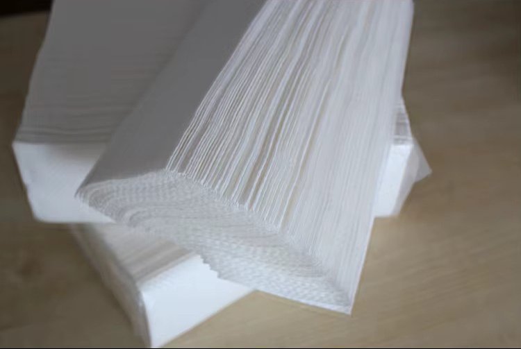
Compare the trade reality before you sign a spec, because the market is where the honest failures live. A live listing observed in the current catalogue offers a custom napkin at 33 by 33 centimetres, 1/4 fold, 18 gsm, 20 pieces per bag, 100 bags per carton, with fully embossed or edge-embossed finishes as options – quoted here as observed market data rather than as any Top Source specification, since this site publishes no napkin grammage or unfolded size. Another listing, same market, carries a buyer review that reads: “size of napkins was too small. will reorder larger size.”
That review is the entire argument for designing from the folded face. The buyer did not get a bad napkin; they got a specification whose relationship to the table was never checked. The unfolded size, the fold, the placement and the way a guest will hold the folded corner are one design decision, and the listing format – attribute after attribute – actively hides that connection.
Video: “toilet tissue paper manufacturing process”, Top Source Paper own channel. Mill footage from the paper line; it is not a napkin printing or folding demonstration.
The Multi-Site Rollout Spec

For a chain, a napkin is not one product; it is the same product at every location, which is a stronger requirement. Write the spec so that it is identical to read anywhere:
Branded napkin specification for multi-site operation
“Size and fold: napkin to be supplied in the confirmed fold, with unfolded dimensions, sheet count per bag and bags per carton stated on the order. Observed market formats run 33×33 cm at 1/4 fold; the confirmed sample supersedes this.”
“Artwork: version number to appear on the purchase order and to match the archived file. Reorder plate charge: none, per the mill’s archived-artwork policy.”
“Placement: logo to sit wholly inside the guest-facing face of the folded napkin, out of the embossed border band, verified on a physical folded proof before plate-making.”
“Colour: production to match the approved first-article sample, with the retained production reference sheet kept by both parties for claims.”
“Print: 1-4 colours in eco water-based ink per the ink specification in the printed-napkin guide, with food-contact position stated there.”
The route from here is a chain of four fixed steps: design the folded face first, keep the logo out of the border band, lock the artwork with a version number, and compare every reorder against the approved sample under restaurant light. The water-based ink specification decides what the colours can honestly be, the logo-napkin workflow travels from artwork to shipment, and the napkin range is where this placement spec gets built against a real fold. When the opening date is fixed and the proofs are on the table, send the artwork with its version number and the folded proof question comes back before any plates are made.
Frequently Asked Questions On Branded Napkins
Where should a logo go on a folded napkin?
On the guest-facing face, which is one quarter of the sheet for a 1/4 fold and one eighth for a 1/8 fold, and clear of the embossed border band. Design from that face outward, and verify on a physical folded proof before plates are made.
How much of a printed napkin design is actually visible?
One quarter on a quarter-fold and one eighth on an eighth-fold, by definition of the fold. The rest of the artwork lives inside the folds and reappears only as the napkin is unfolded while being used.
Can you print a logo and emboss a border on the same napkin?
Yes, and the two must be designed together. Print is laid over the embossed surface, so specify emboss first and keep the logo out of the border band, or the pattern competes with the mark for the same area.
Why do napkin colours drift between reorders?
Every print process drifts; the question is whether the drift has a referee. Archive the artwork with a version number, approve a physical first-article sample, keep a production reference sheet, and match each reorder against it.
How many colours fit a branded napkin print?
One to four colours in water-based ink is the stated capability here, and the ink and registration details – including which colour counts actually hold on tissue – are specified in the printed-napkin guide.